The story of the Tuneliq logo
This logo starts with two dots.
Every gift happens between two people: one with something to say, and one waiting to hear it. Some words feel too light on a card and too hard to say out loud. Tuneliq turns them into a song, one that exists nowhere else, written for the person who receives it.
Singing greeting cards have been around for decades, but they all sing the same tune. We wanted to give this old gift a new life.
The whole story of the logo fits in one picture.
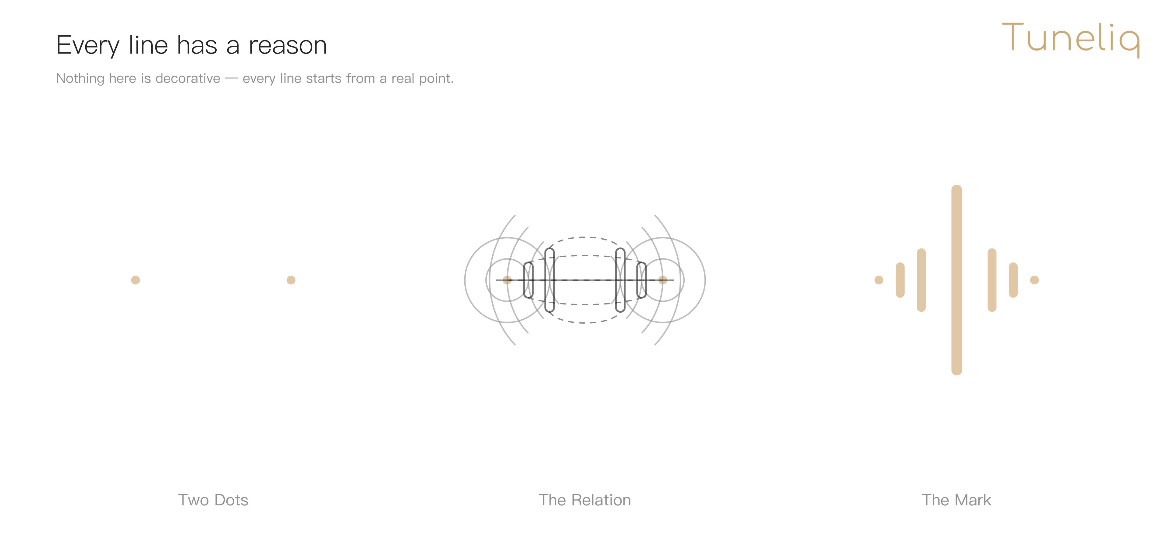
Two people, before the words
Read it left to right.
At the far left, there are only two dots. They're the first thing we drew. We tried notes, waveforms, and gift boxes first, then gave them all up: a symbol that works for any music product belongs to no one. What belongs to Tuneliq is the two people. The giver, and the listener.
At first, they're quiet.
The song speaks for them
In the middle, sound appears. Waves ripple out from each dot, and the pull between them becomes a connection: the words that were hard to say are turning into a song, traveling from one heart to the other.
A song needs a body. Tuneliq Card is a greeting card so thin that, seen from the side, it almost disappears into a single line. A phone turned on its side makes the same line. The song plays there first, then lives in the card. Two carriers, one silhouette.
We stood that line in the very center. It isn't decoration; it's the product itself, standing there.
So at the far right, the mark is complete: two dots at the ends, and the song spreading between them.
Soft shapes, strict bones
The geometry holds up under inspection: every capsule's corner radius is exactly half its width, the heights step down from the center outward, and every guide lands on a real endpoint, corner, or the axis of symmetry.
Most of the design work was deletion. Tech words, holiday trim, anything that looked like a music player: all of it went. What's left is these seven shapes.
When it plays
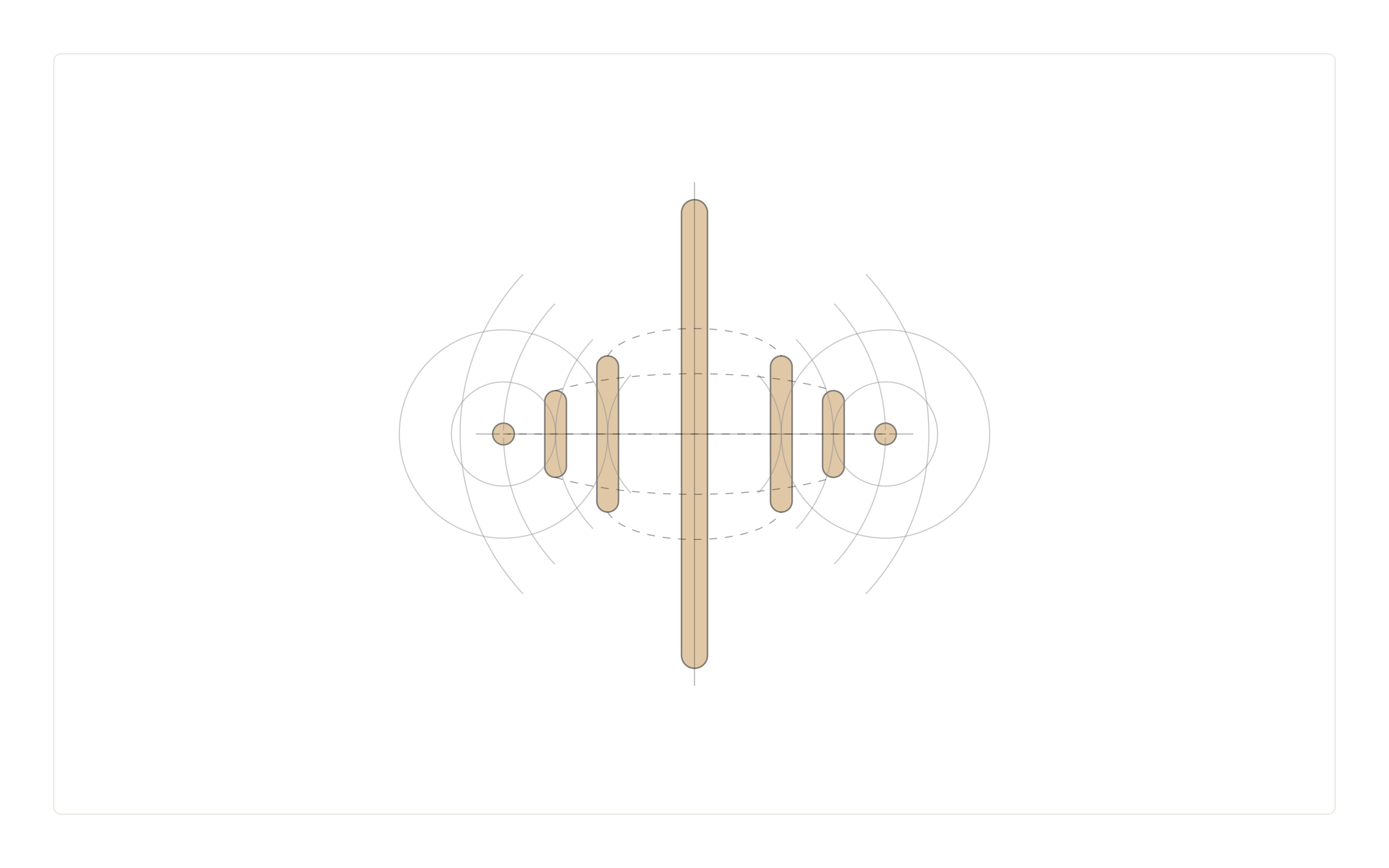
When it plays, the song spreads outward, growing shorter and softer, like a stone dropped into water.
The space between the shapes is left empty on purpose: what you wrote, and what you didn't, goes in there. Empty is what makes room.
Only the beginning
A logo earns its meaning through use: every song written and every gift opened stores a little more music in these seven shapes.
Two dots. One line. One mark. An old gift's new life begins with being heard.
Hear the Heart.